The fastest way to delay a custom donut box order is to send artwork the printer cannot use. A logo pulled off a website, text sitting right on the fold, a file in the wrong color mode—each one bounces back for a fix, and a box that could have shipped this week slips to next. None of it is hard to avoid once you know what a print department is actually looking for, so here is how to hand over files that go straight to press.
Start from the dieline, not a blank rectangle
A donut box is not a flat sheet. It is a folded structure, and the printer supplies a dieline—a template showing exactly where the box is cut, where it folds, and where the panels end up once it is assembled. Your artwork gets built on top of that template, so the front panel art lands on the front and the lid art lands on the lid rather than wrapping across a crease. Ask for the dieline before you design anything, keep its cut and fold marks on their own layer, and never resize or nudge it to make your art fit. If the layout does not work within the dieline, the design changes, not the template.
It helps to think panel by panel rather than treating the flat template as one canvas. Sketch which artwork belongs on the lid, the front, and the sides, and remember that some panels flip or rotate once the box is folded, so text that reads correctly on the flat sheet can end up upside down on the assembled box. A quick way to catch this is to print the dieline at scale, fold a paper mock-up, and check that every element sits where you expect before you commit to the real file.
Bleed, trim, and the safe zone
Three boundaries do most of the work on any packaging file, and mixing them up is the most common reason art comes back. The trim line is the dieline itself—where the blade cuts. Bleed is the margin you extend background color and images past that cut line, so that a hair of misalignment on the cutter does not leave a thin white sliver at the edge. The safe zone is the opposite inset: the area, held in from the trim, where your logo and text need to stay so nothing important gets shaved off.
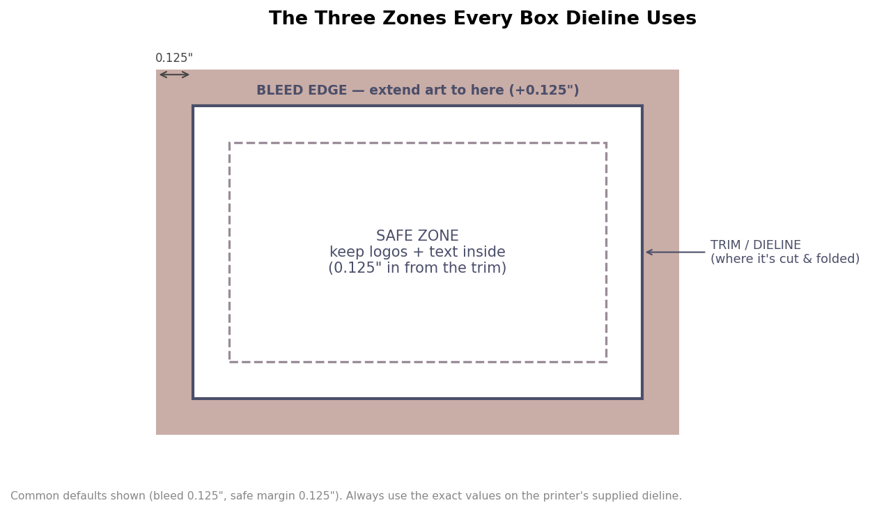
Common defaults are an eighth of an inch of bleed beyond the trim and at least an eighth of an inch of safe margin inside it, but these are not universal. The value that matters is whatever the supplied dieline specifies, so read the template rather than assuming. The practical habit is simple: push backgrounds all the way to the bleed edge, and pull anything you cannot afford to lose comfortably inside the safe zone.
Resolution: why a website logo will not do
Images need to be about 300 dpi at the size they actually print on the box. The trap is that a logo saved for a website might be only a few hundred pixels wide, which looks crisp on a screen at 72 dpi but turns soft and blocky when it is stretched across a box panel. Enlarging that small file does not add detail; it only spreads the same pixels thinner.
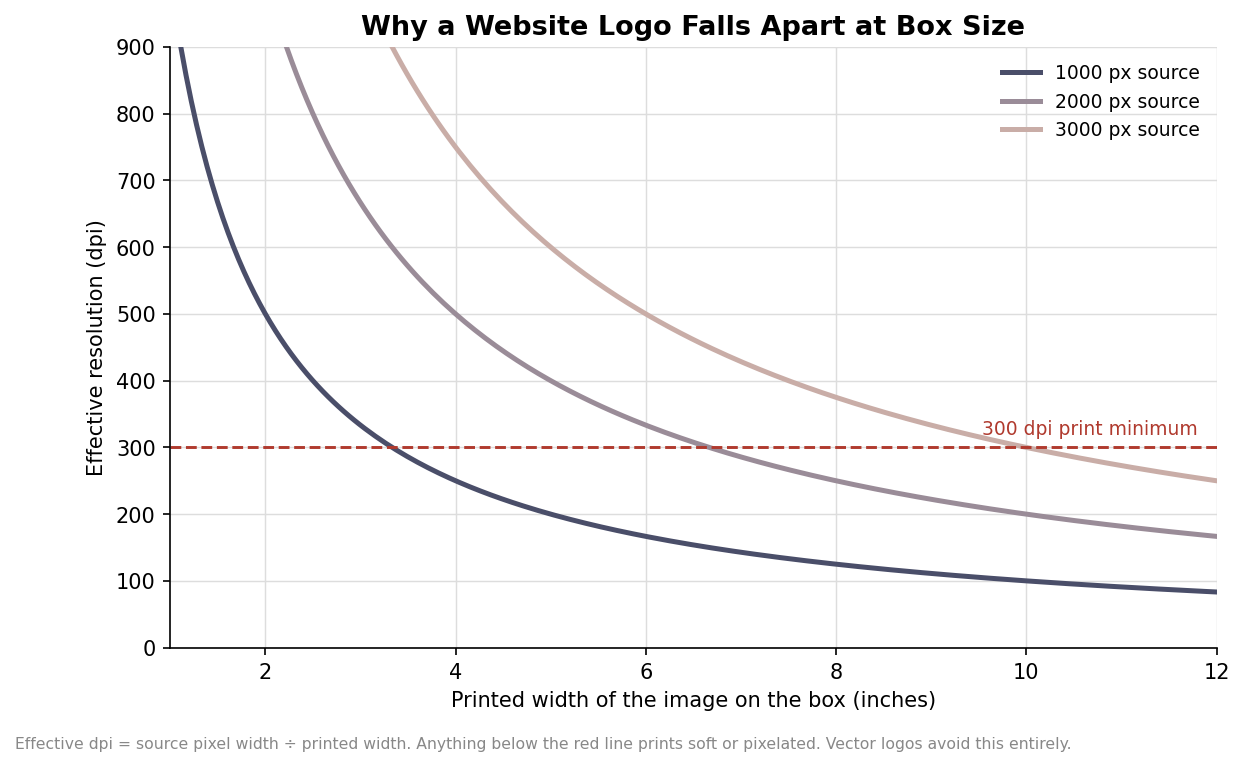
The chart shows why the source file size matters: the same image printed wider drops in effective resolution fast, and once it falls under the 300-dpi line it prints fuzzy. The clean way out is to supply logos and text as vector art—built from paths rather than pixels—because vectors stay razor sharp at any size. Save photographs and vectors accordingly, and never upscale a small raster and hope it holds.
Color: what changes between your screen and the box
Screens build color from light in RGB, while presses build it from ink in CMYK, so a design almost always shifts when it moves from monitor to box. Set your file up in CMYK from the start rather than converting at the end, and expect bright, saturated screen colors—electric blues, vivid greens—to come back a shade more subdued. When a brand color has to match exactly across every run, call it out as a specific Pantone spot color instead of relying on process CMYK to approximate it.
Stock changes color too. On uncoated brown kraft, ink soaks in and every color reads darker and more muted than the same ink on bright white board, which is why a design that pops on a white box can look flat on kraft. Bright colors on kraft often need a white underprint laid down first to keep them from going muddy, so if you are printing vivid art on a brown box, ask the printer whether that white base is included. The only reliable way to know how a color will land is a physical proof on the actual stock, which is always worth requesting before a large run.
Files, fonts, and the proof
Print departments want vector files—PDF, AI, or EPS—with fonts converted to outlines so a typeface you own does not get silently swapped for something else on a machine that lacks it. Embed any linked photos so they travel with the file, keep the dieline on its own clearly named layer, and flatten nothing you might need to edit. Then, before you approve production, look hard at the proof: check the spelling, confirm the art sits inside the safe zone on every panel, and verify the colors against your Pantone references. Ten minutes with a proof is the cheapest insurance there is, because a mistake caught on the proof costs nothing, while the same mistake caught on a delivered pallet of boxes costs the whole run.
Leave a Reply