If you have ever carried home a dozen doughnuts, there is a good chance the box was pink. Not white, not brown kraft, not printed with the shop’s name in gold, but a plain, slightly glossy pink. That color is one of the most recognizable pieces of food packaging in America, and almost nobody who buys a pink box knows why it is pink. The answer is a genuinely good story, and understanding it also happens to teach you something useful about choosing your own doughnut boxes.
The pink box came from a price, not a designer
The pink doughnut box traces back to Southern California in the 1970s and to Cambodian refugees who built an enormous network of independent doughnut shops across Los Angeles County. The figure most often credited is Ted Ngoy, sometimes called the Donut King, who arrived as a refugee, learned the trade, and went on to open and franchise dozens of shops while helping other Cambodian families into the business. As the widely told account goes, Ngoy or his associate Ning Yen asked their box supplier for something cheaper than the standard white bakery box, and the supplier had pink stock it could offer at a discount. The shops took the cheaper box, and because so many of the region’s doughnut stores shared the same suppliers and the same tight margins, pink spread until it became the default.
The precise details differ from one telling to another, including the exact shade and the reason the pink stock happened to be cheaper, so it is fair to treat the specifics as folklore even though the broad outline is well documented. What is not in doubt is that the pink box was an economic decision that turned into a cultural signature.
Why the color actually stuck
A cheaper box explains how pink started, but not why it lasted fifty years. Part of the answer is cultural: in several Asian traditions red and pink read as lucky and auspicious, which made the color feel right rather than merely cheap to the families running the shops. Part of it is simple recognition. Once a critical mass of shops in a region used the same box, the pink box itself became a signal for fresh, independent, made-this-morning doughnuts, the opposite of a national chain’s branded packaging. For a small shop, that association is worth something, which is exactly the kind of calculation you should make when you choose your own box today.
What pink does to your printing
Here is where the history becomes practical. A colored base is not a neutral canvas, and this is the single most common surprise for a shop ordering custom boxes for the first time. Printing inks are semi-transparent, so any color you lay down on pink board mixes with the pink underneath it. A navy logo skews toward purple, a yellow all but disappears, and a full-color photograph prints muddy and warm because there is no white beneath the ink to make the colors read true. That is precisely why the classic pink box carries only a simple one-color stamp, often in red, maroon, or black, chosen because it still looks clean on a pink ground. If your brand lives on a specific blue or a photographic design, you generally cannot get it accurate on pink board; you either choose one or two spot colors that are designed to sit on pink, or you print on a white coated box where the inks reproduce faithfully. Deciding that before you send artwork saves a frustrating sample round.
Pink, kraft, or white: choosing your base
Think of the base color as a branding decision with a cost attached rather than an afterthought. Pink and kraft blanks are the cheapest tier because they are bought plain and printed lightly or not at all, and they carry a friendly, independent, low-overhead signal. White coated board costs a little more but is the right surface for full-color and photographic printing, so it suits a brand that wants its packaging to look designed. Grease resistance depends less on color than on the coating: most doughnut boxes rely on a light clay coating and on getting the product to the customer quickly, and none of them are meant to hold a warm, glazed dozen for hours without some softening or grease-through, so match your holding time to the box rather than expecting any paperboard to be waterproof.
What it costs, and when custom pays off
Custom printing only makes sense at the right volume, and the math is worth seeing before you commit. Per-box cost falls steeply as quantity rises, and the premium for a full-color custom box over a plain pink blank shrinks as you scale, because the fixed costs of plates and setup spread across more units. At a hundred boxes a custom printed dozen box can cost several times what a blank pink one does; by a few thousand boxes the two are far closer. The chart below shows that curve with indicative figures so you can find the point where printing your own brand stops being a luxury.
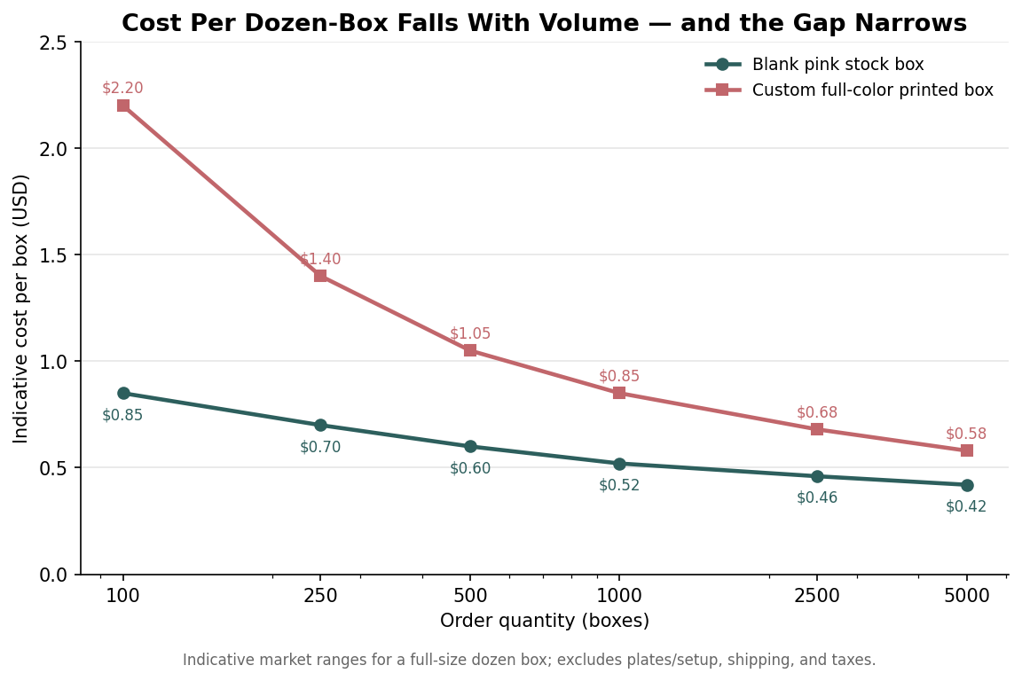
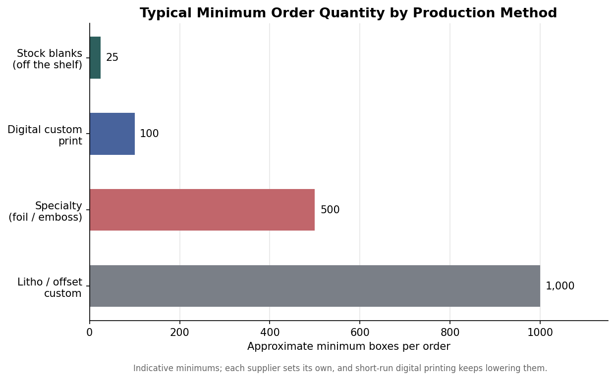
Quantity also determines whether a printer will take your job at all, because minimums vary sharply by production method. Off-the-shelf blanks can be bought in small packs, short-run digital printing has brought custom minimums down to the low hundreds, and traditional offset or specialty finishes like foil still expect larger runs. The second chart lays out typical minimums so you can aim your order at a method that fits your volume rather than being told after the fact that you have to buy a thousand boxes.
So the pink box is not just a quirk of history; it is a lesson in packaging economics that still applies. It became the standard because it was cheap, it endured because it was recognizable, and the same two forces, cost and recognition, are exactly what you are balancing when you decide whether your own doughnuts go out in a plain pink box or a printed one with your name on it.
Leave a Reply